Case Study
OnDemandKorea Case Study

End-to-end web redesign and unified design system for a Korean streaming platform serving 400K+ content hours across 200+ partners.
End-to-end web redesign and unified design system for a Korean streaming platform serving 400K+ content hours across 200+ partners.
OnDemandKorea is one of the largest Korean content streaming platforms in North America, offering 400K+ content hours, 500+ assets, and partnerships with 200+ content providers and channels. I collaborated with the UX manager and senior UI designer on the end-to-end web experience redesign while simultaneously developing a unified design system that scales across responsive breakpoints and streamlines engineering handoff.
OnDemandKorea’s existing web experience suffered from inconsistent UI patterns, poor content discoverability, and a lack of systematic design thinking. As the platform scaled its content library and membership tiers, these gaps became critical.
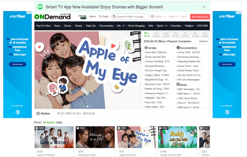 OndemandKorea 1.0
Switching platforms mid-lifecycle destroys metadata and organizational structure built in production.
Users struggled to find favorites and resume watching content.
Mobile web lacked account icons on GNB. Hidden profile access.
PIP didn’t work across pages, leading users to confuse it with video ads.
Understanding who uses OnDemandKorea was critical to shaping every design decision from content hierarchy to navigation patterns to membership conversion flows.
I worked within a cross-functional team collaborating with the product manager to align on PRD requirements, partnering with a senior UI designer on visual consistency, and coordinating with engineers.
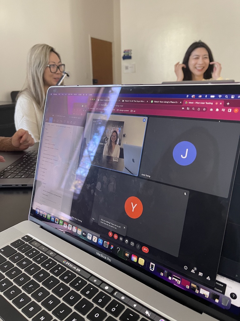
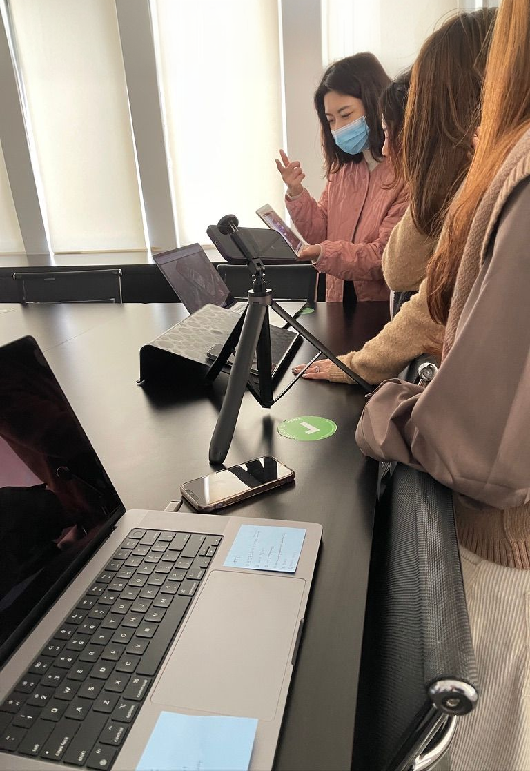
Usability testing with 5 participants across 10 tasks.
Component library with anatomy and usage docs.
End-to-end layouts from 420px to 1920px.
Production specs and visual QA reviews.
During research and user feedback, I discovered users struggle to find up-to-date information on currently airing programs.
Our data indicates that the variety shows, dramas, and documentary categories have the highest CTR overall on the website and attract the most viewing hours. As a result, the leadership particularly wants to emphasize these three categories in the TV guide.
| 금 | 토 | 일 | 월 | 화 | 수 | 목 | 금 | 토 | 일 | 월 | 화 | 수 | 목 | 금 | 토 | 일 | 월 | 화 | ||
|---|---|---|---|---|---|---|---|---|---|---|---|---|---|---|---|---|---|---|---|---|
| 4/14 | 4/15 | 4/16 | 4/17 | 4/18 | 4/19 | 4/20 | 4/21 | 4/22 | 4/23 | 4/24 | 4/25 | 4/26 | 4/27 | 4/28 | 4/29 | 4/30 | 5/1 | 5/2 | ||
| Category | ||||||||||||||||||||
| Drama | Drama Category | 19,855 | 19,962 | 15,399 | 20,947 | 18,389 | 17,335 | 18,294 | 18,505 | 17,735 | 15,988 | 18,904 | 16,421 | 16,982 | 16,959 | 18,702 | 17,912 | 15,172 | 18,505 | 16,690 |
| Variety | Variety Category | 31,967 | 35,848 | 40,729 | 35,037 | 31,795 | 32,240 | 33,812 | 29,815 | 35,765 | 40,348 | 33,519 | 30,487 | 30,487 | 30,446 | 31,864 | 35,916 | 39,901 | 31,100 | 28,450 |
| Docu | Docu Category | 13,436 | 13,060 | 11,191 | 13,357 | 12,778 | 13,329 | 9,428 | 12,149 | 13,086 | 11,109 | 12,202 | 11,654 | 13,486 | 13,850 | 12,845 | 12,863 | 11,137 | 11,377 | 10,882 |
| TV Widget | ||||||||||||||||||||
| TV Widget Program Click | — | — | — | — | — | — | — | — | — | — | — | — | — | — | — | — | — | 1,046 | 1,381 | |
| Featured Collection | — | — | — | — | — | — | — | 3,589 | 3,849 | 4,808 | 3,813 | 2,024 | 4,440 | 2,517 | 2,683 | 3,150 | 5,118 | 2,775 | 2,383 | |
| Carousels | ||||||||||||||||||||
| Carousel | What's new | — | — | — | — | — | — | — | 3,423 | 3,577 | 3,445 | 2,840 | 2,525 | 2,512 | 2,595 | 2,851 | 3,096 | 2,619 | 2,523 | 2,130 |
Our design team conducted structured usability testing with 5 participants across 10 core tasks, measuring both objective success rates and subjective difficulty ratings.
During the usability testing, we discovered that users did not notice the state changes of the bookmark icon when it was added to favorites. Micro-interactions have a significant psychological impact on users. I have improved user performance for the “Add to Favorites” feature by providing users with hints through icon changes and micro interactions when they successfully perform the action.
I led the design system research auditing existing patterns, organizing component files, and defining usage guidelines in collaboration with designers and engineers.
Primary, secondary, tertiary variants with size scales and disabled states.
Anatomy, variants, usage patterns and responsive behavior.
Default, typing, active states with adaptive width behavior.
I designed the complete responsive web experience across 6 breakpoints from 420px mobile to 1920px desktop.
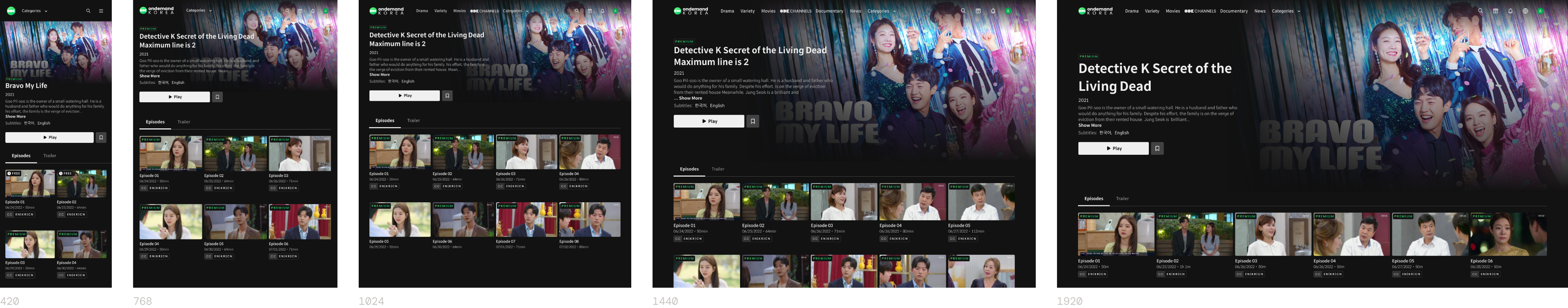
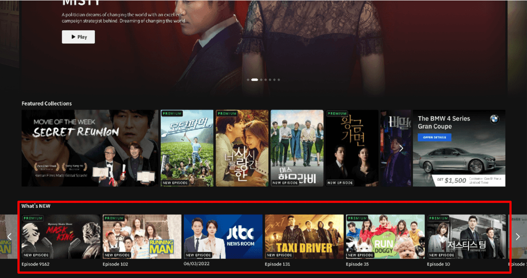
The final deliverables span the complete web experience — from content browsing through program detail, episode playback, and membership conversion.