Case Study
Screenkey Case Study

Encrypted screenings with flexible collaboration tools, accessible on any device, anywhere.
Encrypted screenings with flexible collaboration tools, accessible on any device, anywhere.
ScreenKey is a secure screening platform that bridges the gap between production and distribution — giving teams encrypted screenings with flexible collaboration tools, accessible on any device.
Industry Interview
Switching platforms mid-lifecycle destroys metadata and organizational structure built in production.
Tools that work for producers overwhelm critics. Tools for viewers frustrate post-production supervisors.
Distribution tools are flat and rigid. They offer no way to carry the richness of production context through to delivery.
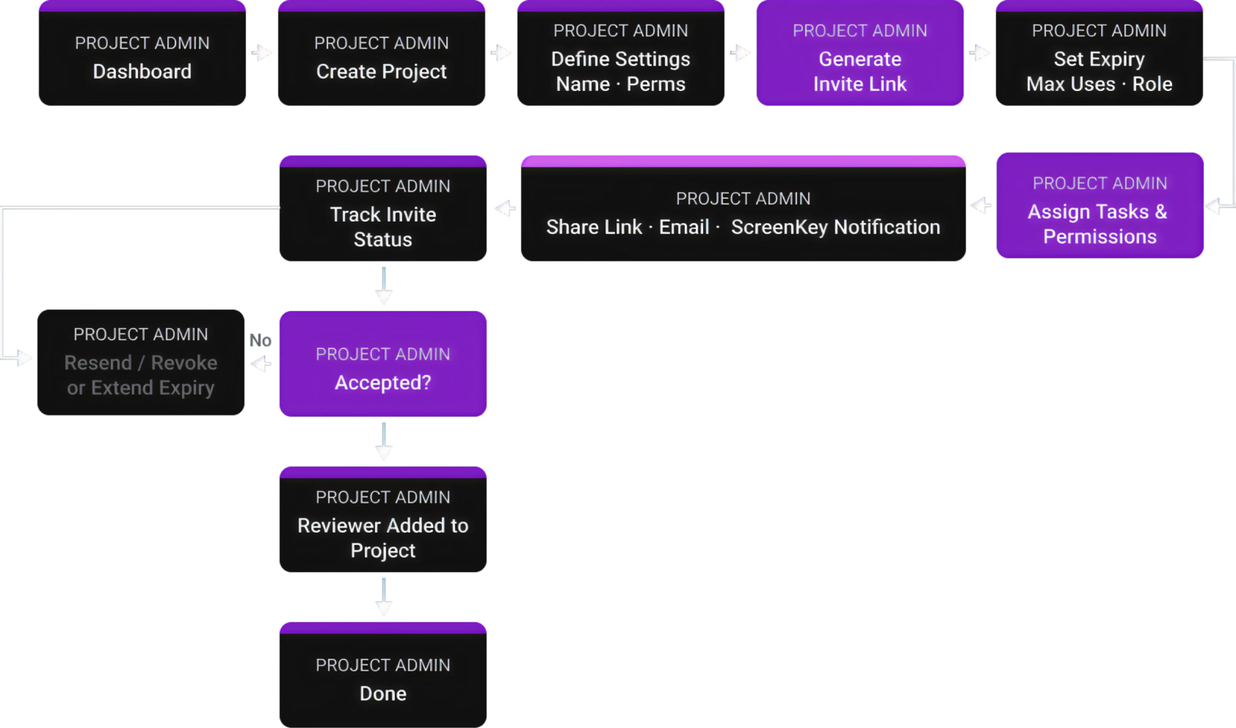
Admins have no real-time clarity on whether a project is Live or Secure — causing costly errors.
12 deep-dive industry interviews and competitive analysis of 5 legacy platforms revealed a universal pattern.
How competing platforms separate admin control from end-user experience — and where the gaps live.
Every competitor either exposes full project structure (Frame.io) or completely hides it (Indee, Vision Media, CineSend, Screeners.com). None offer a middle ground — selective transparency that gives users context without complexity.
| Platform | Admin View | User View | Orientation |
|---|---|---|---|
|
Frame.io
Production-Centric
|
Workspace → Projects → Folders → Files; role-based perms; versioning & feedback | Projects they're invited to → Folders → Files; can review/comment | Production |
|
Indee.tv
Awards & Sales
|
Campaigns/Screening Rooms; viewer perms; analytics; forensic watermark & security | Curated screening room — playlist or single asset; no folders, no collaboration | Distribution |
|
Vision Media
Enterprise Campaigns
|
Campaigns by Title/Season; branded FYC portals; invitation control & analytics | Branded portal with titles; playback-only; no comments or annotations | Awards |
|
CineSend
Indie & Festivals
|
Festival/Distributor portals; DRM, expiry, geo-blocking; secure delivery methods | Festival portal or secure link; playback-only; temporary & restricted access | Festivals |
|
Screeners.com
Press Access
|
Studio campaigns; curated hubs; per-user watermark; campaign analytics & branding | Netflix-like gallery by title/episode; playback-only; no uploads or comments | Awards/Press |
A flat list fails after 20% of items. This hierarchy scales from a single indie short to a multi-season enterprise distribution.
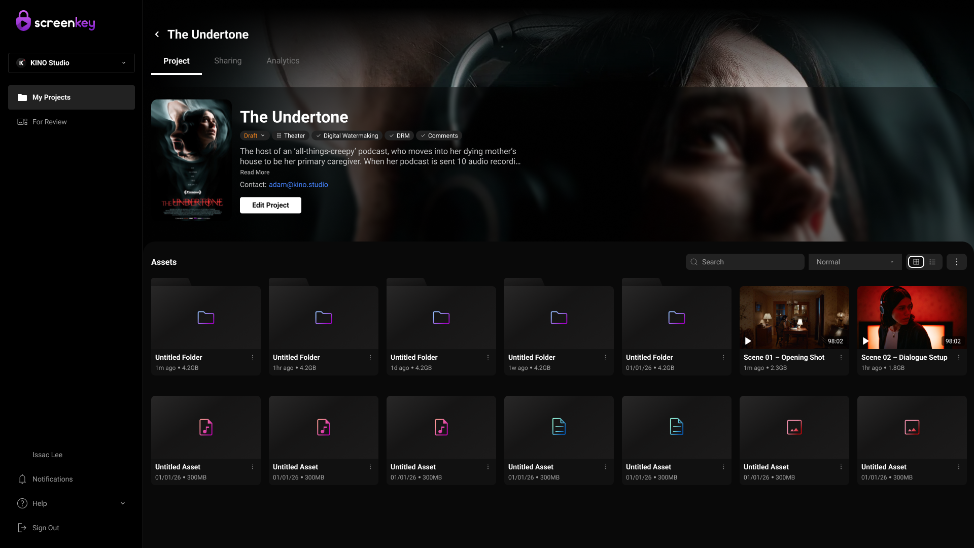
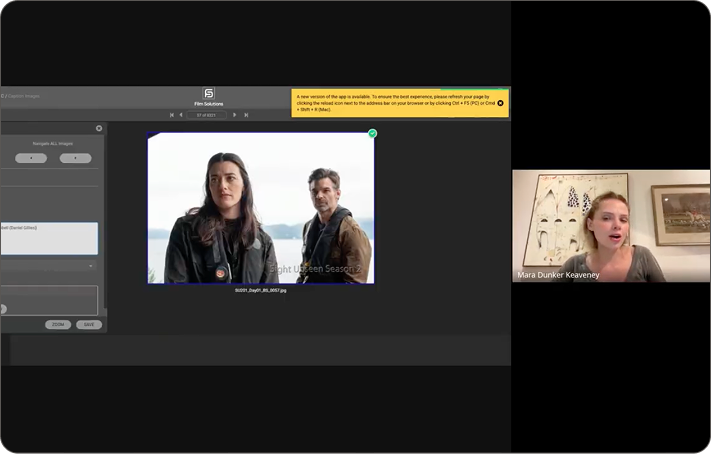
Grid View
Grid view in the ScreenKey app presents content as visual cards with thumbnails, making it easier for users to quickly browse and recognize projects or media, especially during exploration or when visuals matter most. In contrast, list view organizes content in a structured, table-like format with detailed metadata such as dates, access levels, and status, which supports efficient scanning, comparison, and task-driven actions like sorting or managing permissions.
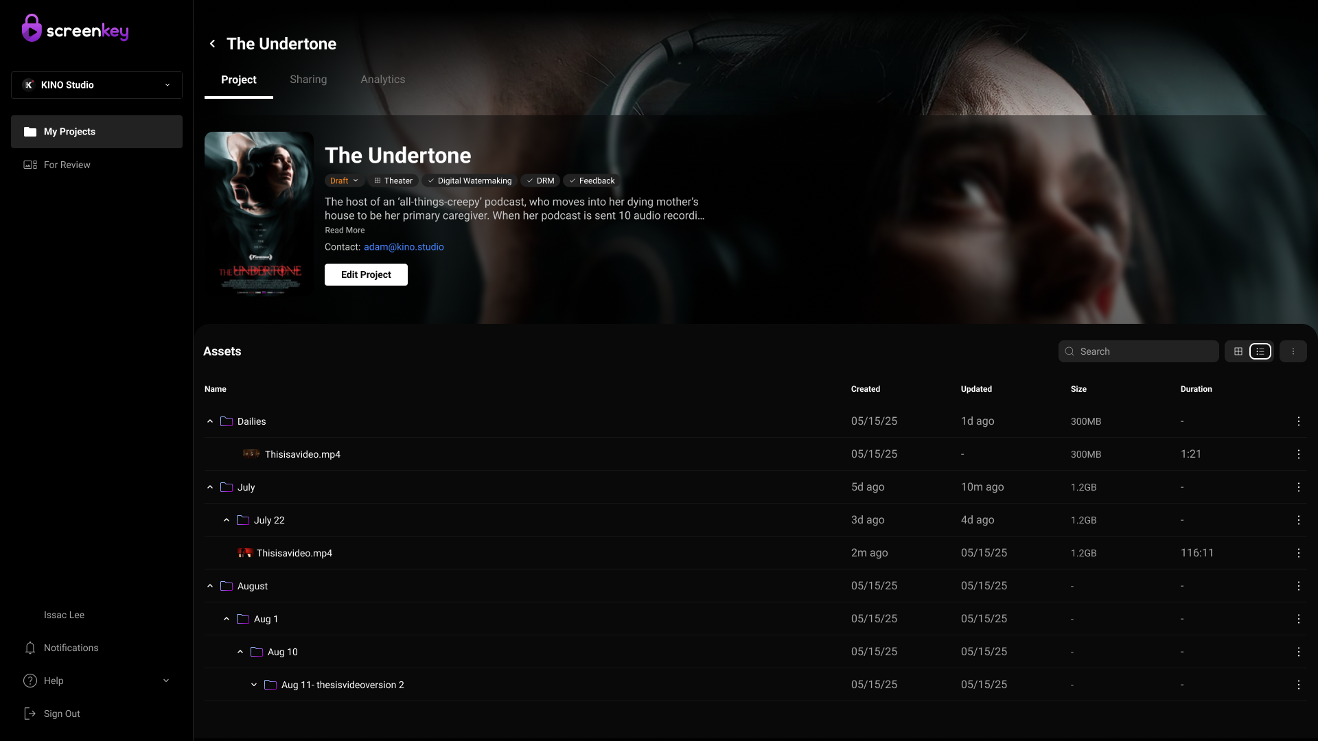
List View
List view in the ScreenKey app displays content in a structured, row-based format with key details like file name, date, access permissions, and status, enabling users to efficiently scan, compare, and manage large amounts of data. This layout supports task-driven workflows such as sorting, filtering, and bulk actions, making it especially useful for admins or power users who need quick access to detailed information and control over sharing or review processes.
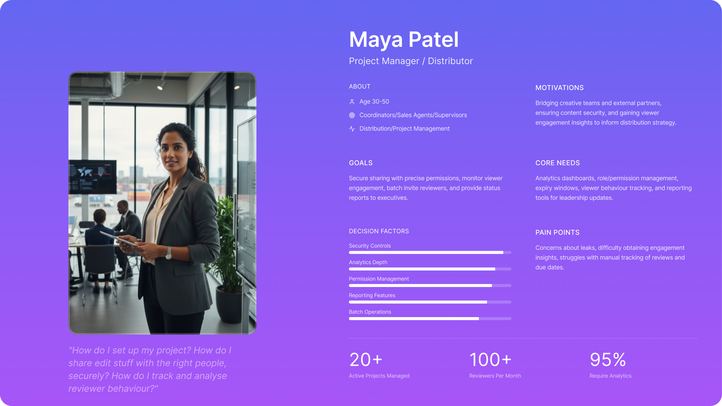
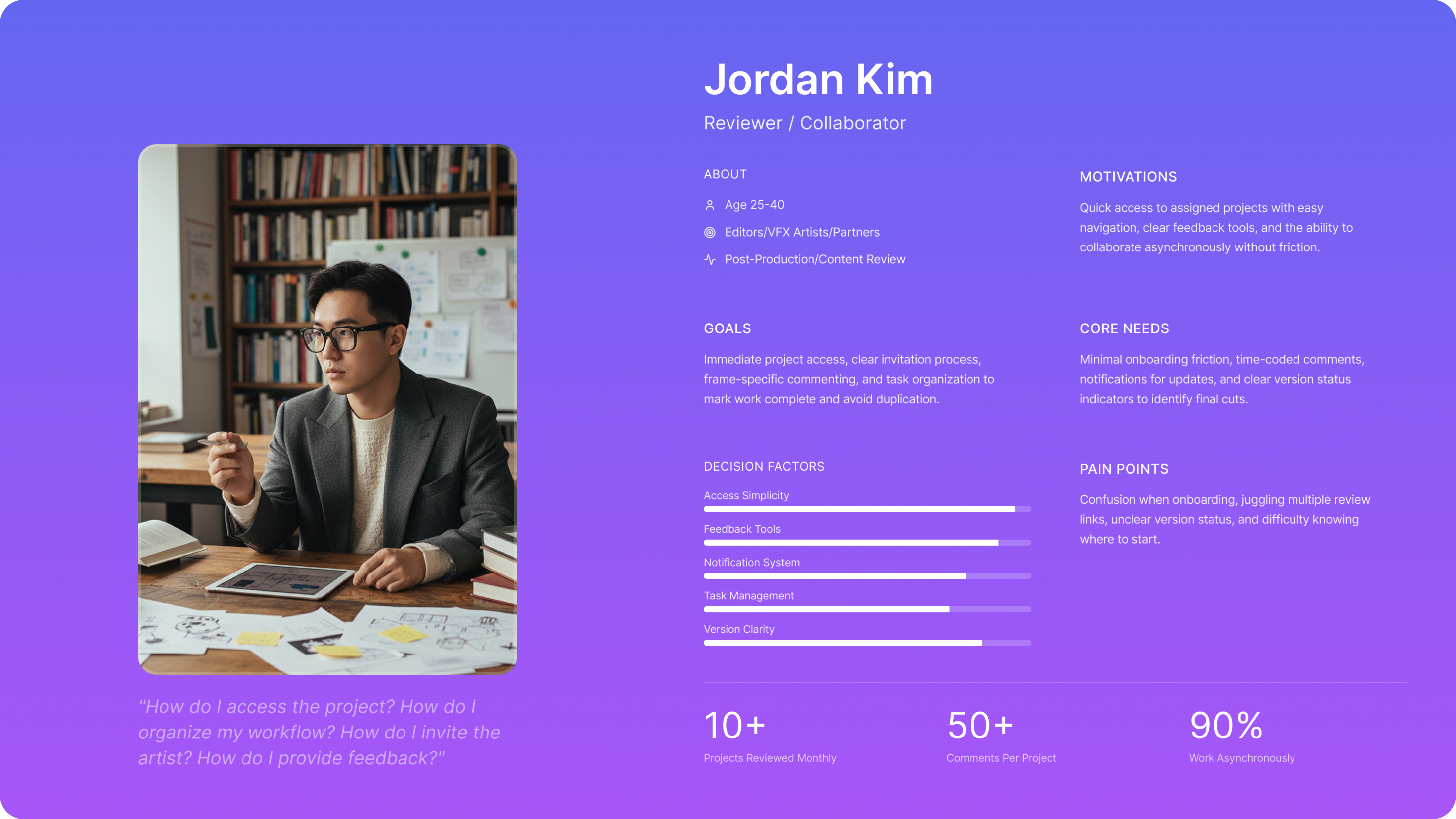
Design decisions are based on direct feedback from industry users, revealing current pain points with Screenkey.
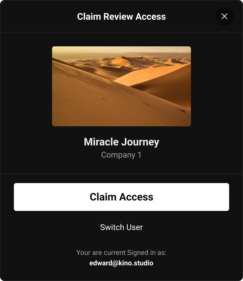
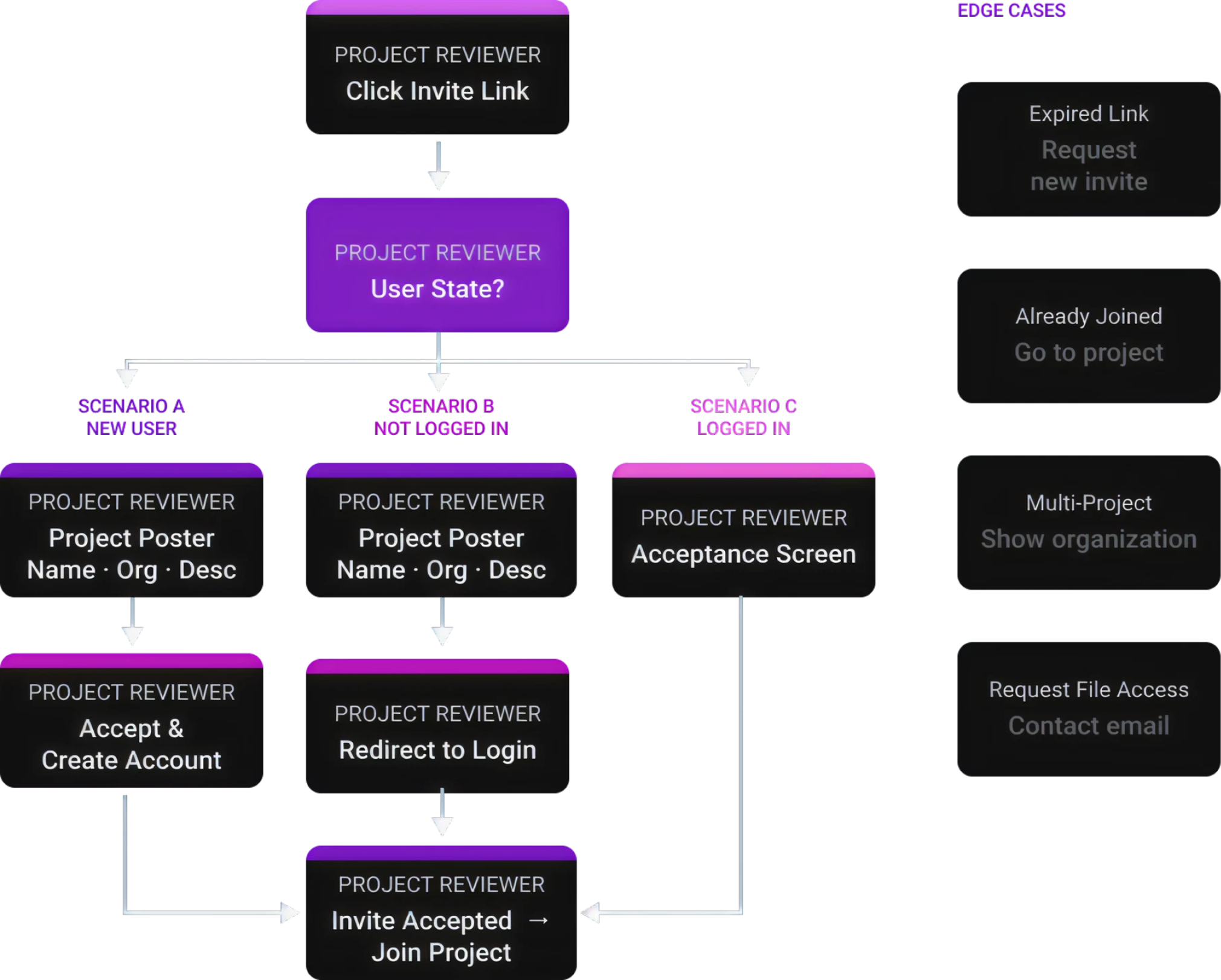
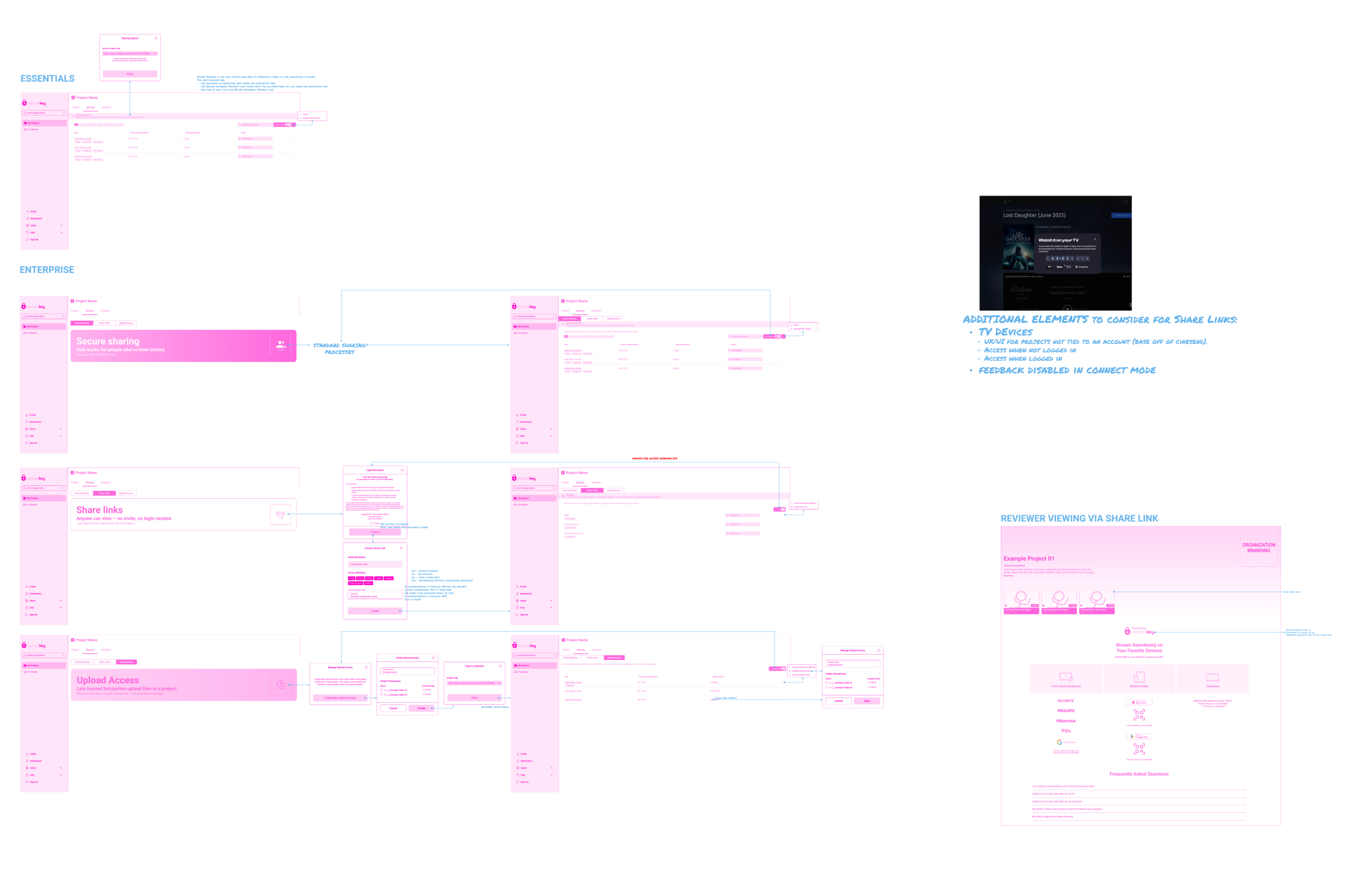
Reviewers were entering projects from a shared invite link without enough context. It felt unclear whether they were joining a screening event, opening a project, or viewing a file.
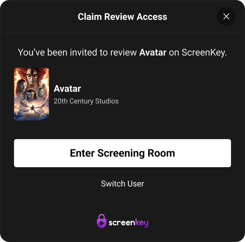
Introduced a clearer invite-entry experience with project context upfront — including project title, relevant details, and a direct path to view invited projects.
Reduced confusion at entry and made reviewer access feel intentional, not like a generic link handoff.
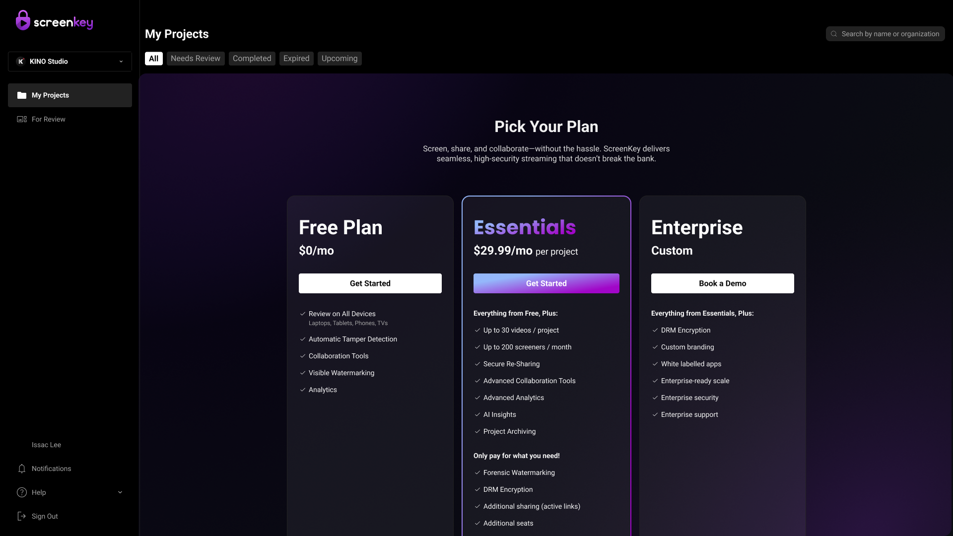
Users are being pushed into a pricing decision before experiencing any product value, leading to high bounce rates. Without context, trust, or understanding of benefits, users are more likely to leave instead of engaging.
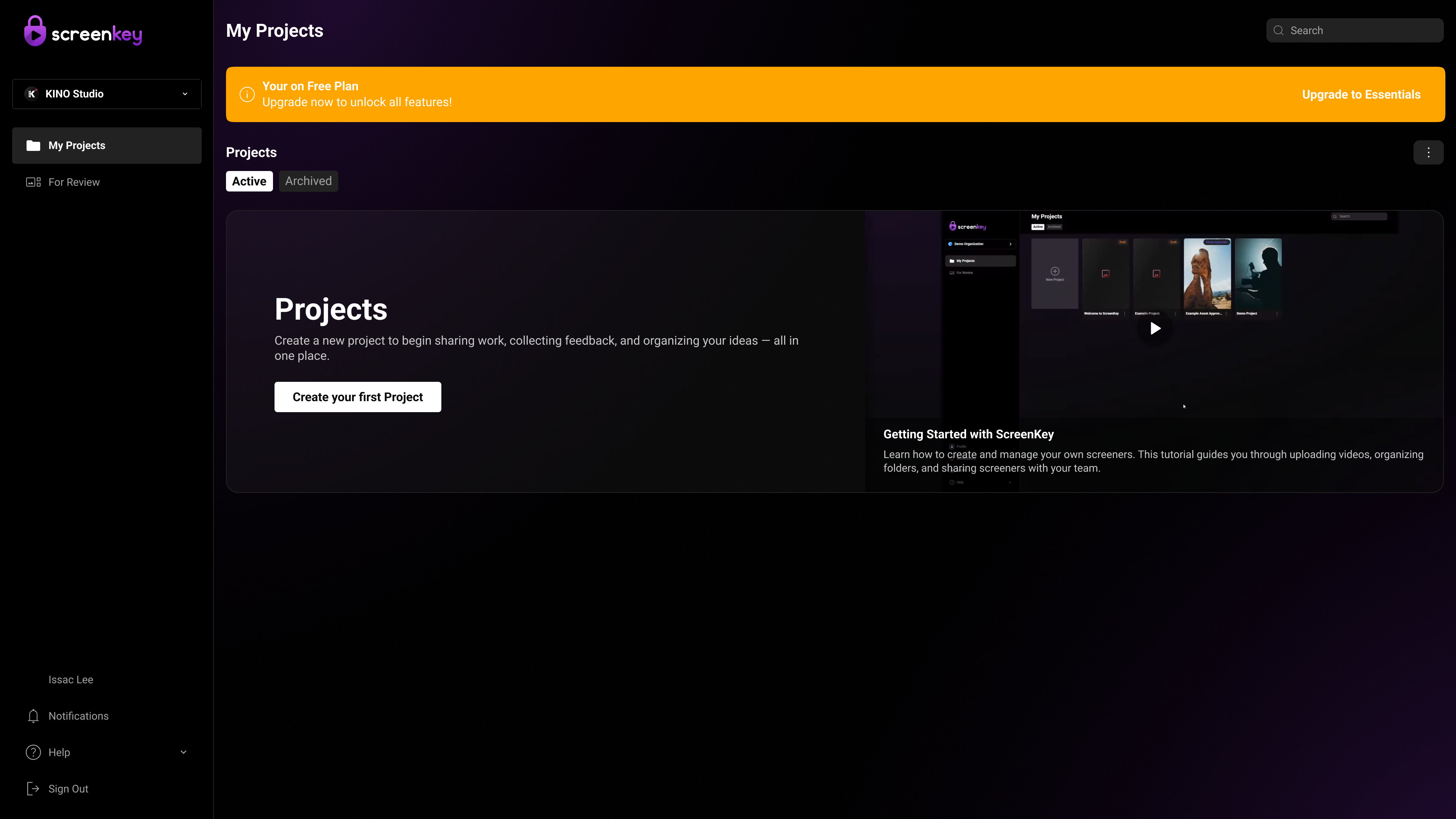
Shift to a value-first experience by letting users create a project immediately instead of showing pricing upfront. Use a subtle upgrade banner to communicate limits and only prompt for plans after users experience value, reducing bounce and improving engagement.
This shift to a value-first onboarding reduces bounce, increases user activation (more users creating their first project), and improves conversion by introducing pricing after users experience value. It also enhances user confidence and sense of control, leading to higher engagement and a smoother overall experience.
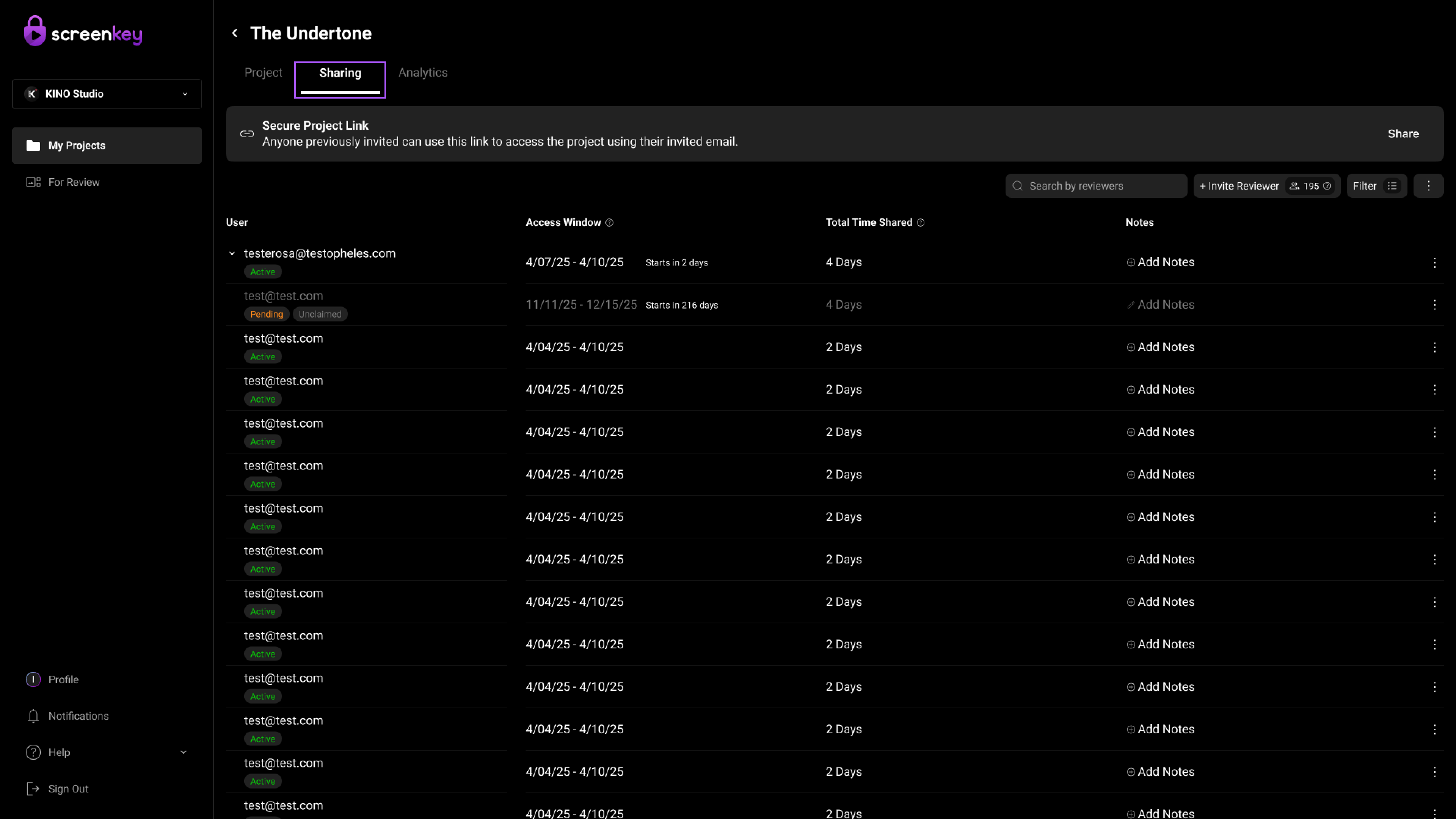
Access management was inconsistent, with Upload Access misplaced outside the Sharing tab. This led to low discoverability and confusion about managing permissions. Users struggled to understand how different access types.
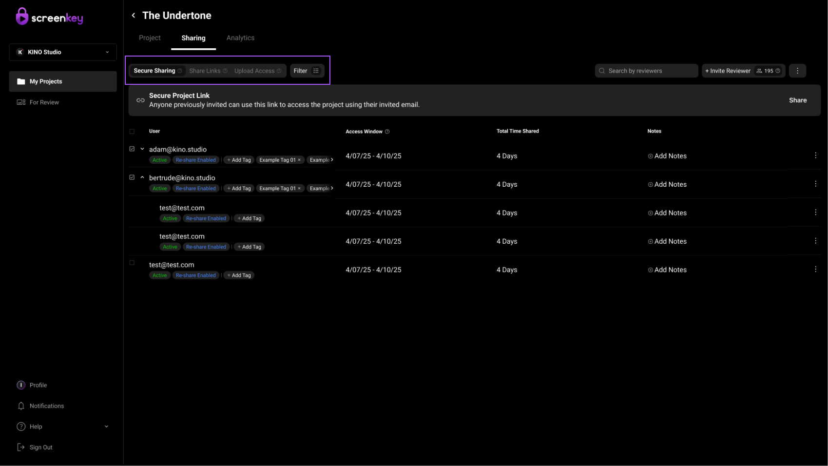
All access controls were centralized into a unified Sharing experience by introducing an Upload Access sub-tab alongside existing sharing options, using consistent UI patterns and interaction models.
Upload Access being explicitly defined reduces ambiguity around contributor roles.
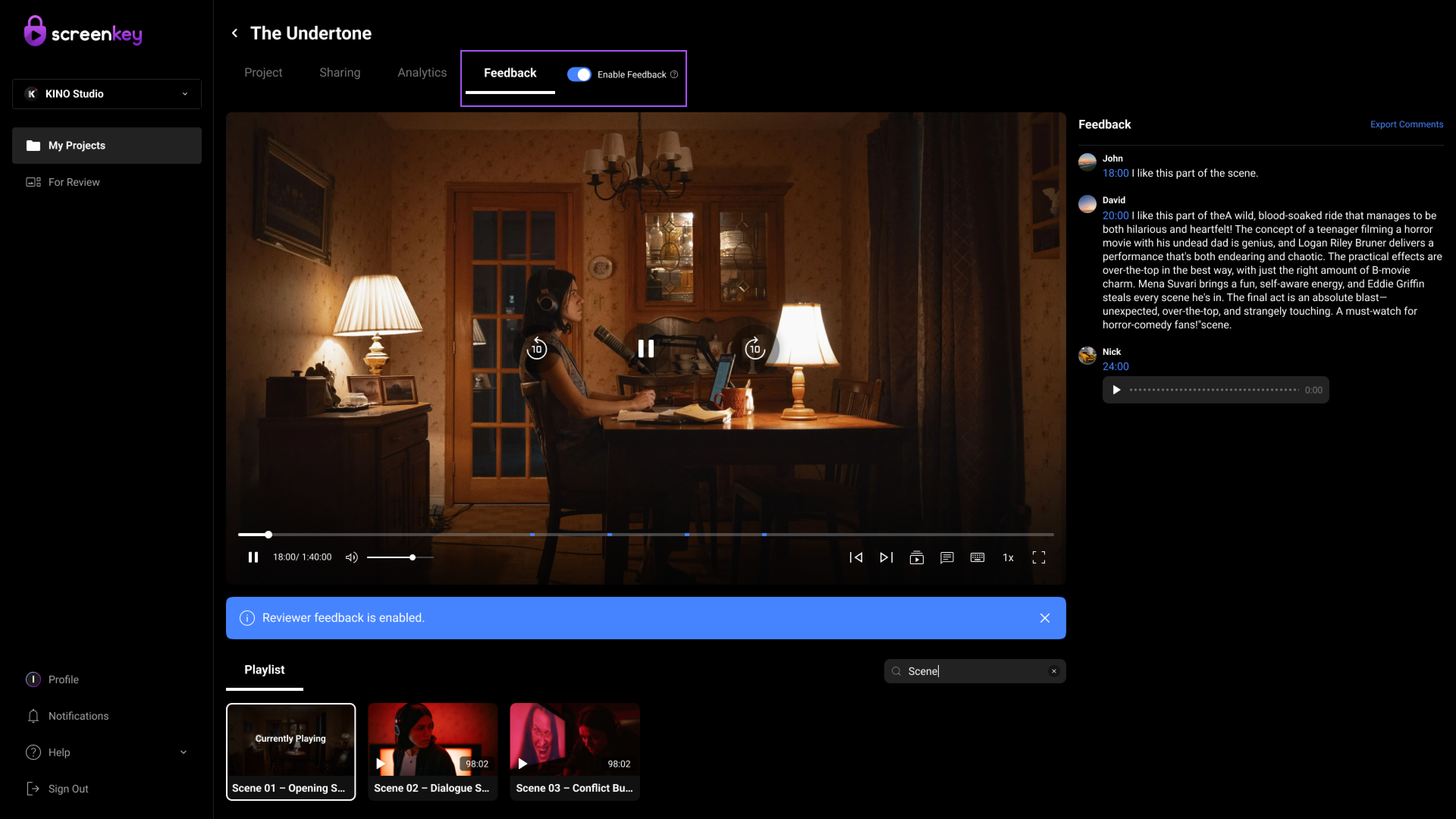
ScreenKey's feedback workflow is inefficient due to unclear comment organization, weak status visibility, limited reply feedback visibility, and poor video navigation, making it difficult for users to quickly review, respond to, and act on feedback.
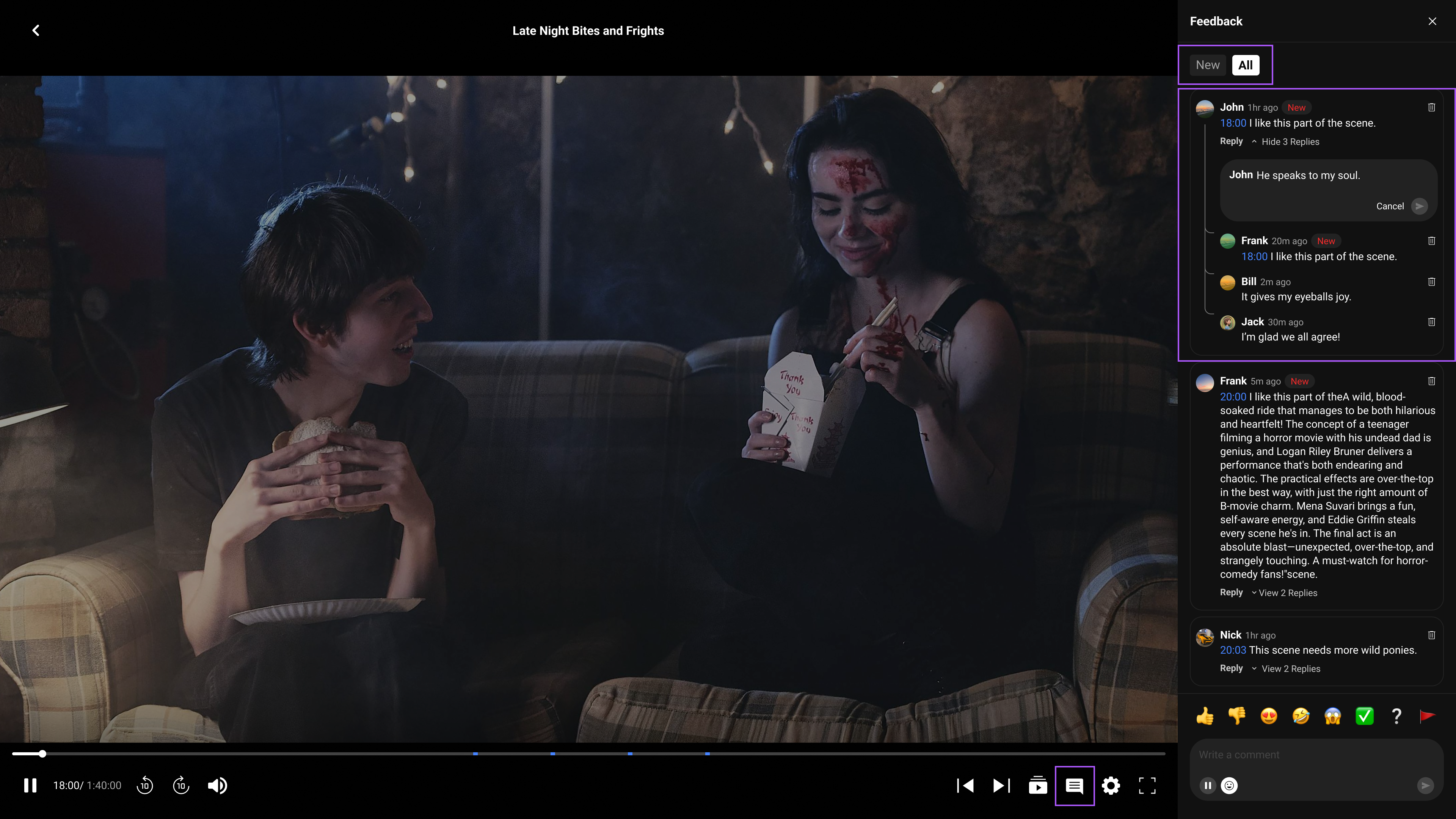
Simplify the experience by introducing clear sorting, visible comment and reply states (new/seen/resolved), one-click timestamp navigation, intuitive filtering, and a more structured reply feedback flow to support fast scanning, response, and prioritization.
Simplifying the experience with clear sorting, visible comment states, and structured reply flows improves users' ability to quickly scan and prioritize feedback, reducing time spent searching for relevant information. Features like one-click timestamp navigation and intuitive filtering enable faster access to context, leading to more efficient decision-making and response workflows. Overall, this enhances clarity, reduces missed or unresolved comments, and supports a more organized and responsive collaboration experience.
Web
Mobile
A flat list fails after 20% of items. This hierarchy scales from a single indie short to a multi-season enterprise distribution.